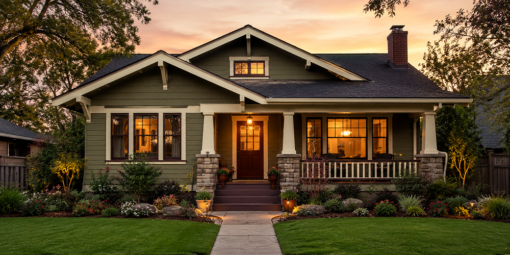
Traditional Craftsman Paint Colors and Classic Exterior Schemes (With Placement Tips)
Craftsman homes weren’t designed to be blank canvases—they were designed to look grounded. Their low roofs, deep eaves, generous porches, exposed rafter tails, and chunky trim details were all meant to feel honest, hand-built, and connected to natural materials.
That design mindset comes straight out of the Arts & Crafts movement, which pushed back against fussy, mass-produced ornament and celebrated simplicity, craftsmanship, and nature. In the U.S., “Craftsman” became widely associated with Gustav Stickley and The Craftsman magazine in the early 1900s, which helped popularize the style and its ideals.
FOR THE READERS
Gustav Stickley’s Craftsman Homes and Bungalows – In 1901, Gustav Stickley created the first uniquely American style of furniture and home design—known as Craftsman…
Most classic Craftsman bungalows date roughly from 1900–1930, and the enduring color logic from that era still holds up: earthy body colors, warm (not icy) light trim, and deeper accents that emphasize structure.
Below are traditional, period-appropriate Craftsman paint schemes (not just colors), plus where they typically go—perfect for pairing with your swatches and example homes.
The “rules” Craftsman color schemes tend to follow
1) Nature-forward, muted, and warm
Traditional palettes lean toward mossy greens, olive, ochre, clay reds, warm grays/greiges, and browns—colors that harmonize with wood, brick, and stone. Benjamin Moore and Sherwin-Williams both describe Craftsman palettes as restrained and historically rooted, emphasizing earthy, warm, muted hues.
2) Trim often reads darker than you’d expect
Unlike many styles where bright white trim is the default, Craftsman trim can be medium-to-deep to outline structure and weight (think: beams, brackets, knee braces, window trim, porch details).
3) Accents are intentional, not busy
A Craftsman scheme can handle three (sometimes four) colors because the architecture has multiple “zones”—body, trim, sash, and door—plus porch ceilings and brackets.
Before you pick colors: map the house like a system
A quick, practical way to keep a Craftsman from looking stripy:
- Body: siding and main wall planes
- Trim: corner boards, window/door casing, fascia, bargeboards
- Sash: window sashes (often darker than trim)
- Accent: brackets/knee braces, gable details, porch rails, or a subtle band
- Door: a “jewel tone” moment (but still earthy)
(This also sets you up perfectly to add swatches in consistent blocks.)
FOR THE READERS
Creating Classic Interiors in Your Arts and Crafts Home Craftsman Homes and Bungalows – This book shows how to balance period authenticity with modern living, providing practical advice for renovation, restoration, and new builds.
10 traditional Craftsman exterior paint schemes (with placement)
Each scheme is written as Body / Trim / Sash / Door (Accent). Feel free to attach brand-specific swatches later (Benjamin Moore, Sherwin-Williams, etc.)—these combos are “style-correct” even when the exact paint names vary.
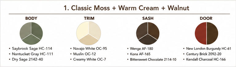
1) Classic Moss + Warm Cream + Walnut
Why it works: Green + cream + brown mirrors landscape + wood tones; very “bungalow” appropriate.
- Body: moss or sage green
- Trim: warm cream / aged ivory
- Sash: deep brown (walnut/espresso)
- Door: brick red or deep brown
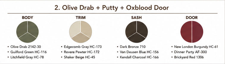
2) Olive Drab + Putty + Oxblood Door
Why it works: A hallmark Craftsman look—substantial and earthy, especially with stone piers.
- Body: olive drab (slightly gray, not bright)
- Trim: putty / warm greige
- Sash: dark bronze-brown
- Door: oxblood / burgundy
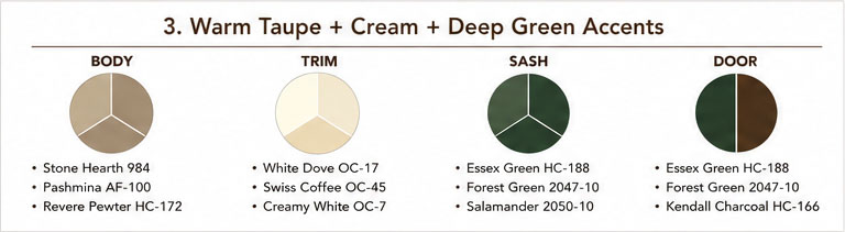
3) Warm Taupe + Cream + Deep Green Accents
Why it works: Taupe reads historically plausible and lets trim profiles and porch structure carry the visual interest.
- Body: warm taupe / “mushroom”
- Trim: cream
- Sash: deep forest green
- Door: deep green or brown
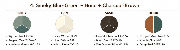
4) Smoky Blue-Green + Bone + Charcoal-Brown
Why it works: Blue-green shows up often in Craftsman-friendly palettes and pairs naturally with stained wood and dark metals.
- Body: blue-green (muted, slightly gray)
- Trim: bone / antique white
- Sash: charcoal-brown
- Door: coppery brown or deep teal
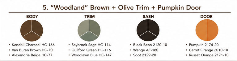
5) “Woodland” Brown + Olive Trim + Pumpkin Door
Why it works: Brown-forward schemes look especially authentic on shingle-sided Craftsman homes.
- Body: medium-to-deep brown (reads like stain)
- Trim: olive or muted green-gray
- Sash: nearly-black brown
- Door: pumpkin / burnt orange
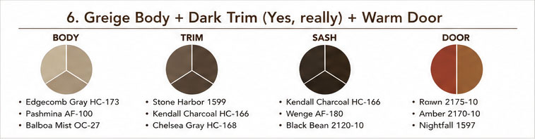
6) Greige Body + Dark Trim (Yes, really) + Warm Door
Why it works: Craftsman architecture can “hold” dark trim because the elements are thick and structural.
- Body: warm greige (avoid cool gray)
- Trim: dark taupe/bronze
- Sash: same as trim or slightly darker
- Door: amber, russet, or deep red-brown
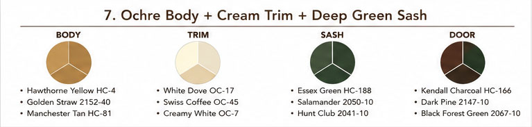
7) Ochre Body + Cream Trim + Deep Green Sash
Why it works: Ochre harmonizes with aged wood and brick. Done right, it reads historic—not cartoon—because it’s muted.
- Body: ochre / muted mustard
- Trim: warm cream
- Sash: deep green
- Door: dark wood tone or green-black
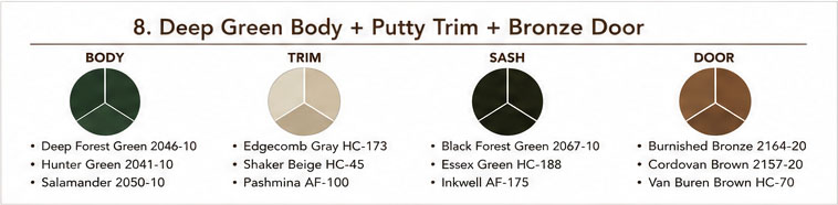
8) Deep Green Body + Putty Trim + Bronze Door
Why it works: Bold but period-aligned—great for homes with strong gables and heavy porch columns.
- Body: deep pine / heritage green
- Trim: putty / warm gray-beige
- Sash: near-black green
- Door: bronze, brown-black, or stained wood look
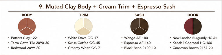
9) Muted Clay Body + Cream Trim + Espresso Sash
Why it works: Clay tones sit beautifully against stone foundations and brick chimneys.
- Body: clay / terra-cotta (subtle, dusty)
- Trim: cream
- Sash: espresso brown
- Door: deep brown or oxblood
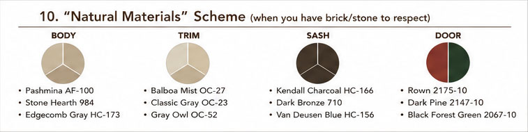
10) “Natural Materials” Scheme (when you have brick/stone to respect)
Why it works: This approach keeps masonry as the star and makes the painted parts feel cohesive.
- Body: a color pulled from the mortar (warm greige, taupe)
- Trim: lighter version of body (not stark white)
- Sash: dark brown/bronze
- Door: restrained accent (deep red-brown, green-black)
Related read: How to Identify Your Old Home’s Period and Style (US Field Guide, c. 1850–1940)